Clear App Navigation: How Simple Menus Prevent SaaS Churn
A practical guide to designing intuitive SaaS navigation menus. Learn how clear visual hierarchy, simple menu architecture, and friction-free user flows reduce cognitive load, increase session duration, and prevent client churn.
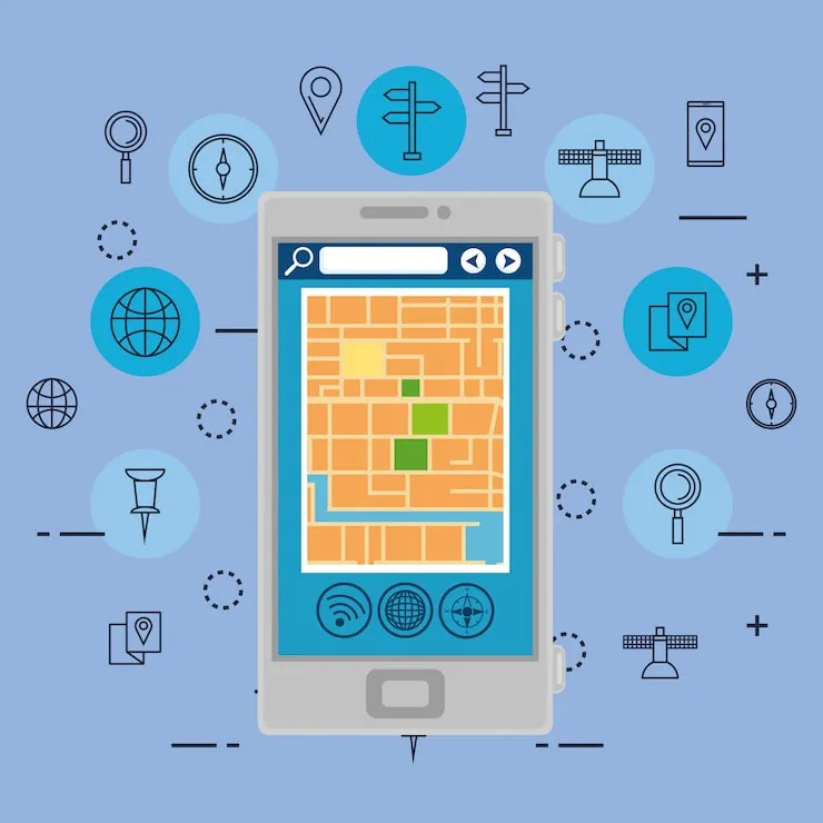
TL;DR: When SaaS users get confused by bloated, multi-tiered menus, they don't ask for help—they cancel their subscriptions. Modern web applications live or die by their information architecture. By stripping away redundant submenus, organizing features around core user workflows, enforcing clear visual active states, and limiting top-level choices to 5–7 items, SaaS companies reduce user cognitive load and slash churn rates by up to 35%. Explore our research-driven UI/UX design services to elevate your product interface, see how our custom web development builds sub-second Next.js web applications, learn how Figma design systems reduce dev time, discover how micro-interactions double session duration, and read our guide on high-converting landing page UX psychology.
The 5 W's of Simple SaaS Navigation Design
To understand why clear navigation is the single most critical structural element of digital product retention, here is the 5 W's breakdown:
- Who: Product managers, UI/UX designers, SaaS founders, frontend engineers, and product-led growth (PLG) teams building modern web and mobile applications.
- What: SaaS Navigation Architecture Optimization—designing intuitive, low-friction navigation menus that streamline user orientation, reduce time-to-value (TTV), and prevent feature discovery fatigue.
- Where: Across desktop sidebars, top navigation bars, mobile bottom tab bars, command palettes (
Cmd + K), and contextual sub-navigation frameworks. - When: Implemented during early-stage product design, major UI redesigns, or whenever user session analytics reveal drop-offs, high bounce rates, or recurring support tickets regarding "missing" features.
- Why: Confusing navigation increases cognitive friction. When users struggle to complete daily tasks because menu items are hidden behind ambiguous icons or deep sub-menus, product adoption stalls and monthly churn spikes.
┌─────────────────────────────────────────────────────────────────────────┐
│           The 5 W's: SaaS Navigation & Churn Prevention                 │
├──────────────┬──────────────────────────────────────────────────────────┤
│ Dimension    │ Plain-English Explanation                                │
├──────────────┼──────────────────────────────────────────────────────────┤
│ 👤 WHO       │ Product designers, SaaS founders, CTOs & UX researchers  │
│ 🧠 WHAT      │ Clear Navigation Architecture (5-7 item limit & 1-click) │
│ 🔒 WHERE     │ Desktop sidebars, mobile bottom tabs, Cmd+K command bars │
│ ⏱️ WHEN      │ Product scaling, UI redesigns & PLG onboarding sprints  │
│ 🎯 WHY       │ Slash cognitive load, speed up TTV & prevent user churn  │
└──────────────┴──────────────────────────────────────────────────────────┘
The Core Analogy: The Highway Signage System vs. The Mystery Maze
To understand how user navigation affects brain chemistry and product retention, compare your SaaS application interface to physical infrastructure:
1. The Highway Signage System (Clear Navigation)
Imagine driving down an interstate at 70 mph. The overhead signs are large, high-contrast, and display concise labels like "Exit 14B: Financial Reports".
- You instantly know where you are, where you are going, and how to get back if you miss a turn.
- The cognitive effort required is virtually zero, allowing you to focus on driving (completing your work).
2. The Mystery Maze (Bloated Navigation)
Now imagine driving into a parking garage with no signs, handwritten arrows pointing in opposite directions, and hidden turnoffs hidden behind unlabelled grey doors.
- You get frustrated, waste fuel, turn around three times, and swear never to return to that building again.
- In SaaS, this is precisely what happens when users encounter unlabelled icons, nested dropdowns within nested dropdowns, and changing navigation bars across different screens.
┌─────────────────────────────────────────────────────────────────────────┐
│              SaaS Navigation Mental Model Comparison                     │
├─────────────────────────────────────────────────────────────────────────┤
│ 🚗 THE HIGHWAY SIGNAGE SYSTEM (Clear UX Architecture)                    │
│ [ Dashboard ] ──► [ Projects ] ──► [ Analytics ] ──► [ Settings ]        │
│ ✅ Max 5–7 top-level links        ✅ High-contrast active indicators    │
│ ✅ Explicit text labels           ✅ Breadcrumbs for deep paths          │
├─────────────────────────────────────────────────────────────────────────┤
│ 🌀 THE MYSTERY MAZE (Bloated / Obscured Navigation)                     │
│ [ ⚙️ ] ──► (Hover) ──► [ Tools ] ──► (Click) ──► [ Misc ] ──► ???       │
│ ❌ Icon-only mysteries            ❌ 4 levels of nested dropdowns       │
│ ❌ Inconsistent layouts per page  ❌ Zero active state indicators        │
└─────────────────────────────────────────────────────────────────────────┘
The 4 Psychological Laws of Intuitive App Navigation
Designing navigation that feels invisible requires adhering to proven human cognitive limitations:
1. Hick's Law: Time to Decide Increases with Options
Hick's Law states that the time it takes for a user to make a decision increases logarithmically with the number and complexity of choices.
- If your SaaS sidebar contains 24 top-level items, users freeze. They experience decision paralysis.
- The Fix: Group secondary and tertiary tools under logical domain headers (e.g., "Workspace", "Finance", "Account") and cap top-level visible items to 5 to 7 maximum.
2. Miller's Law: The Magic Number 7 (Plus or Minus 2)
The average human brain can only hold 7 (± 2) items in working memory simultaneously.
- When navigation menus display 15 items without clear visual grouping, users cannot mentally map the workspace.
- The Fix: Structure menus using chunking—separating links with subtle borders, section headers, or generous vertical spacing.
3. Fitts's Law: Touch Target Size and Distance
Fitts's Law dictates that the time required to rapidly move to a target area is a function of the ratio between the distance to the target and the width of the target.
- Tiny, 12px menu links placed in the far top corner of a screen require extreme motor precision, causing user misclicks and annoyance.
- The Fix: Ensure menu touch/click targets are at least 44x44px with generous padding around links.
4. Jakob's Law: Users Expect Your Site to Work Like Others
Users spend most of their time on other websites (Slack, Notion, Stripe, GitHub). They bring pre-conditioned mental models to your product.
- Placing primary navigation at the bottom-right of a desktop screen just to be "unique" breaks user expectations and creates friction.
- The Fix: Standardize on vertical left sidebars for complex desktop apps and bottom tab bars for mobile web and native apps.
Best Practices: Desktop Sidebar vs. Mobile Navigation vs. Cmd+K
Modern SaaS applications require multi-layered navigation strategies tailored to device form factors and user experience levels:
| Navigation Pattern | Ideal Use Case | Key UX Rules | Common Pitfall |
|---|---|---|---|
| Vertical Left Sidebar | Complex SaaS B2B Applications (Dashboards, CRMs, Analytics) | Max 7 primary items; collapsible mode for focus; explicit text + icons | Icon-only collapsed mode without tooltips |
| Mobile Bottom Tab Bar | Mobile Web & iOS/Android native views | 3 to 5 core destinations maximum; fixed position; active icon highlight | Hiding key primary features inside a hamburger menu |
Command Palette (Cmd + K) | Power users & keyboard-first tools (GitHub, Linear, Raycast) | Sub-50ms fuzzy search; keyboard navigation; clear category tags | Treating Cmd+K as a substitute for bad primary UI navigation |
| Contextual Top Header | Single-task focused workspaces (Canvas editors, Doc writers) | Breadcrumb path (Workspace / Project / File); primary CTA right-aligned | Crowding header with global account settings |
Real-World UI Code: Clean React & Tailwind Navigation Component
Below is an example of an accessible, responsive SaaS sidebar component built with React, TypeScript, and Tailwind CSS. It features active-state styling, ARIA attributes for screen readers, and clear visual hierarchy:
import React from 'react';
import Link from 'next/link';
import { usePathname } from 'next/navigation';
import { LayoutDashboard, FolderKanban, BarChart3, Settings, HelpCircle } from 'lucide-react';

interface NavItem {
  label: string;
  href: string;
  icon: React.ElementType;
}

const PRIMARY_NAV: NavItem[] = [
  { label: 'Dashboard', href: '/dashboard', icon: LayoutDashboard },
  { label: 'Projects', href: '/projects', icon: FolderKanban },
  { label: 'Analytics', href: '/analytics', icon: BarChart3 },
  { label: 'Settings', href: '/settings', icon: Settings },
];

export function AppSidebar() {
  const pathname = usePathname();

  return (
    <aside className="w-64 h-screen bg-slate-900 border-r border-slate-800 flex flex-col p-4 text-slate-300">
      {/* Brand Header */}
      <div className="flex items-center gap-3 px-3 py-4 mb-6 border-b border-slate-800">
        <div className="w-8 h-8 rounded-lg bg-blue-600 flex items-center justify-center font-bold text-white">
          L
        </div>
        <span className="font-semibold text-white tracking-tight text-lg">LaunchLive</span>
      </div>

      {/* Main Navigation */}
      <nav className="flex-1 space-y-1.5" aria-label="Main Navigation">
        <div className="px-3 text-xs font-semibold uppercase tracking-wider text-slate-500 mb-2">
          Platform
        </div>
        {PRIMARY_NAV.map((item) => {
          const isActive = pathname === item.href || pathname.startsWith(`${item.href}/`);
          const Icon = item.icon;
          return (
            <Link
              key={item.href}
              href={item.href}
              aria-current={isActive ? 'page' : undefined}
              className={`flex items-center gap-3 px-3 py-2.5 rounded-lg font-medium text-sm transition-colors ${
                isActive
                  ? 'bg-blue-600/10 text-blue-400 border border-blue-500/20'
                  : 'hover:bg-slate-800/60 hover:text-slate-100 text-slate-400'
              }`}
            >
              <Icon className={`w-5 h-5 ${isActive ? 'text-blue-400' : 'text-slate-400'}`} />
              <span>{item.label}</span>
            </Link>
          );
        })}
      </nav>

      {/* Footer Support Section */}
      <div className="pt-4 border-t border-slate-800">
        <Link
          href="/support"
          className="flex items-center gap-3 px-3 py-2.5 rounded-lg text-sm text-slate-400 hover:text-slate-100 hover:bg-slate-800/60 transition-colors"
        >
          <HelpCircle className="w-5 h-5 text-slate-400" />
          <span>Help & Support</span>
        </Link>
      </div>
    </aside>
  );
}
Frequently Asked Questions (FAQ)
Q: How many items should be in a SaaS main navigation menu?
A: Limit primary navigation to 5 to 7 visible top-level items. If your platform offers dozens of sub-features, group them under broad domain categories or leverage a secondary sub-header or Cmd + K search bar.
Q: Should SaaS apps use icon-only navigation bars? A: No. Icon-only navigation creates significant cognitive friction because icons are inherently ambiguous (e.g., does a gear icon mean "Account Settings", "System Preferences", or "Project Controls"?). Always pair icons with clear text labels unless space is extremely constrained (e.g., collapsed mobile states with tooltips).
Q: What is the difference between primary and contextual navigation? A: Primary navigation controls global app context (switching from "Projects" to "Billing"). Contextual navigation exists inside a specific section (e.g., switching between "Overview", "Team Members", and "API Keys" inside Project Settings). Separating global from contextual navigation prevents screen clutter.
Q: How does navigation design impact SaaS customer churn? A: Confusing navigation causes "feature blindness"—users fail to find the tools they pay for, experience daily friction, and assume the software is incapable. Streamlined navigation reduces time-to-value, speeds up daily workflows, and builds daily product habits that retain subscribers long-term.
Conclusion
Your app navigation is not a decorative container—it is the central nervous system of your digital product. By enforcing strict 5–7 item limits, clear text labeling, high-contrast active states, and standardized layout patterns, you eliminate user cognitive friction and ensure long-term subscriber retention.
Ready to transform your product interface? Explore our research-driven UI/UX design services or book a strategy consultation with Launch Live Studio today.
Enjoyed this insight
on UI/UX Design & Product Strategy?
"At Launch Live Studio, we help ambitious brands implement these exact systems to drive scalable revenue."
FREE 30-MINUTE STRATEGY CONSULTATION • CLEAR ANSWERS ON OUR FAQ
Related Growth Guides.
UI/UX Design & Product Strategy
Explaining Complex Tech Simply: How Good Visuals and Stories Win Buyer Trust
A comprehensive guide for tech brands on using visual storytelling and progressive disclosure UI to simplify complex products, bridge the buyer trust gap, and accelerate B2B enterprise sales cycles.

Workflow Automation & Systems Integration
Zapier vs Make vs Custom Code: Best Automation Guide
An honest, practical guide comparing Zapier, Make (Integromat), and Custom Code APIs for modern businesses. Discover when to use no-code tools for fast marketing automations, when to use Make for complex multi-step data routing, and when custom serverless microservices save thousands in platform subscription fees.

AI Tool Creation & SaaS Monetization
Usage-Based Stripe Billing for AI Apps: Setup Guide
Master usage-based pay-as-you-go billing for AI applications using Stripe Metered Billing, pre-funded credit wallets, and real-time token tracking. Protect profit margins against LLM API expenses while delivering a friction-free customer experience.