Landing Pages That Actually Convert: The Simple Psychology Behind High-Performing Websites
Discover the simple psychological triggers and UI/UX design principles behind high-converting landing pages. Learn how to remove cognitive friction, build instant visual trust, and turn casual visitors into enthusiastic buyers.
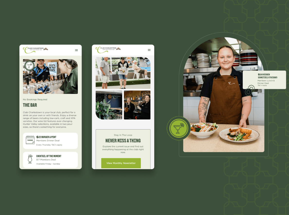
TL;DR: Most landing pages fail not because of ugly color schemes or bad products, but because they overwhelm visitors with cognitive friction, confusing jargon, and too many competing choices. High-converting landing pages succeed by respecting how the human brain actually processes information and makes purchasing decisions. By applying proven psychological principles—such as cognitive fluency, the paradox of choice, visual hierarchy, and de-risking reassurance anchors—and pairing them with research-driven UI/UX design, modern companies routinely turn casual web visitors into enthusiastic buyers and booked discovery calls. Learn how delightful micro-interactions and UI motion hold visitor attention, how scalable Figma design systems speed up consistent frontend builds, how strategy-first branding lowers customer acquisition costs, and how sub-second page load speeds eliminate visitor drop-off.
The 5 W's of High-Converting Landing Page Psychology
To understand why psychology-driven design out-converts decorative web templates every time, here is the complete breakdown using the 5 W's:
- Who: Founders, product designers, marketing executives, and growth operators looking to turn expensive website traffic into paying clients, software signups, and booked discovery calls.
- What: Conversion-Focused Landing Page Architecture—a deliberate design and psychological layout engineered to guide visitors through one clear, compelling, and friction-free decision.
- Where: Deployed across modern Next.js web applications, SaaS marketing frontdoors, e-commerce landing pages, and service inquiry funnels built with modern web technologies.
- When: Implemented whenever launching a new product, scaling ad campaigns, refreshing an outdated website, or diagnosing why high web traffic isn't generating pipeline revenue.
- Why: Attention is scarce and traffic is expensive. When a visitor understands your value in under 5 seconds and feels zero mental strain, conversion rates routinely triple.
┌─────────────────────────────────────────────────────────────────────────┐
│            The 5 W's: High-Converting Landing Page Psychology           │
├──────────────┬──────────────────────────────────────────────────────────┤
│ Dimension    │ Plain-English Explanation                                │
├──────────────┼──────────────────────────────────────────────────────────┤
│ 👤 WHO       │ Growth teams wanting higher conversions from web traffic │
│ 🧠 WHAT      │ Psychology-backed layouts, clear messaging & single CTA  │
│ 🔒 WHERE     │ Next.js marketing pages, SaaS frontdoors & sales funnels │
│ ⏱️ WHEN      │ Launching campaigns, refreshing sites, or boosting CRO   │
│ 🎯 WHY       │ Remove mental friction so visitors take action easily    │
└──────────────┴──────────────────────────────────────────────────────────┘
The Storefront Analogy: The Bargain Bin Warehouse vs. The Curated Boutique
To see why simple psychological clarity outperforms cluttered websites, imagine walking down a bustling shopping street:
Store A: The Bargain Bin Warehouse (Low-Converting Website)
Imagine walking into a store where 40 different neon signs flash overhead at once. Music is blaring, random merchandise boxes clutter the walkways, and a store clerk thrusts five different flyers into your hand shouting: "Sign up for our newsletter! Join our loyalty club! Follow our social media! Buy this blender! Check out our clearance rack!"
Your brain experiences instant sensory overload. You cannot find the price tag, you don't know who to ask for help, and the entire experience feels stressful. You turn around and leave immediately.
Store B: The Curated Boutique (High-Converting Landing Page)
Now imagine walking into a calm, beautifully curated boutique:
- The front display clearly showcases a single, exceptional product with a clean description of what makes it special.
- The aisles are wide, comfortable, and intuitive to navigate (generous whitespace and clear typography).
- A warm, knowledgeable host welcomes you with a friendly smile, answering your immediate questions without pressure.
- There is a single, clear, well-lit counter where completing your purchase takes 15 seconds.
You feel relaxed, confident, and understood. You buy with zero hesitation and tell your colleagues about the experience. That is what a psychology-driven landing page creates for your online business.
┌─────────────────────────────────────────────────────────────────────────┐
│        Store A: The Cluttered Warehouse (High Bounce Rate)              │
├─────────────────────────────────────────────────────────────────────────┤
│ [5 Flashing Popups] ──► [3 Vague Jargon Headers] ──► [8 Different CTAs] │
│         │                         │                         │           │
│         ▼                         ▼                         ▼           │
│ (Sensory overload, visitor feels confused, no clear next step)          │
│ ❌ Result: 1.2% Conversion Rate, 78% Bounce Rate, wasted ad spend       │
├─────────────────────────────────────────────────────────────────────────┤
│        Store B: The Curated Boutique (High Conversion Flow)             │
├─────────────────────────────────────────────────────────────────────────┤
│ [Clear 5-Second Hero] ──► [Instant Social Proof] ──► [1 Direct Action]  │
│         │                         │                         │           │
│         ▼                         ▼                         ▼           │
│ (Crystal-clear value, verified customer proof, zero mental friction)   │
│ ✅ Result: 6.4% Conversion Rate, 3x discovery calls booked, low CAC     │
└─────────────────────────────────────────────────────────────────────────┘
The 4 Psychological Triggers That Drive 80% of Conversions
High-performing landing pages do not rely on manipulative "dark patterns" or fake countdown timers. Instead, they align with four natural ways the human brain processes decisions:
┌─────────────────────────────────────────────────────────────────────────┐
│               4 Essential Psychological Triggers for Conversions        │
├─────────────────────────────────────────────────────────────────────────┤
│ 1. 🧠 COGNITIVE FLUENCY (THE 5-SECOND RULE)                             │
│    If a visitor cannot explain what you sell in 5 seconds, they leave   │
├─────────────────────────────────────────────────────────────────────────┤
│ 2. 🎯 THE PARADOX OF CHOICE (THE 1-GOAL PRINCIPLE)                      │
│    Giving 5 options causes paralysis; giving 1 clear path drives action │
├─────────────────────────────────────────────────────────────────────────┤
│ 3. 👁️ VISUAL HIERARCHY & EYE-PATH ANCHORING                            │
│    Guiding the visitor's natural eye gaze using contrast and direction │
├─────────────────────────────────────────────────────────────────────────┤
│ 4. 🛡️ DE-RISKING & REASSURANCE ANCHORS (LOSS AVERSION)                  │
│    Removing the fear of making a mistake before asking for a commitment │
└─────────────────────────────────────────────────────────────────────────┘
1. Cognitive Fluency (The 5-Second Clarity Test)
Psychologists define cognitive fluency as the ease with which our brain processes information. When something feels easy to read and understand, the brain subconsciously associates it with honesty, safety, and high quality.
If your hero headline says "Synergizing Paradigm-Shifting Enterprise Workflows", the visitor's brain has to work hard to decipher the meaning, sparking subconscious skepticism. If your headline says "Automate Your Client Invoicing in 3 Clicks", the value is instantly grasped and trust is established in milliseconds.
2. The Paradox of Choice (The 1-Goal Principle)
When presented with too many options—such as "Read our blog", "Download our whitepaper", "Follow our Twitter", "Watch our webinar", and "Book a demo"—visitors experience decision paralysis and take no action at all. Every high-converting landing page is designed around one single primary call to action (CTA).
3. Visual Hierarchy & Eye-Path Anchoring
Eye-tracking research proves that visitors scan websites in predictable F-shaped and Z-shaped patterns. High-converting layouts deliberately place the most critical information—the core value proposition, high-profile client logos, and the primary action button—directly along this natural visual highway.
4. De-Risking & Reassurance Anchors (Overcoming Loss Aversion)
Behavioral economics shows that humans feel the pain of a loss twice as intensely as the pleasure of an equivalent gain. Before a visitor clicks your button, their subconscious mind asks: "What if this wastes my time? What if this is expensive? What if they spam my inbox?"
Placing small reassurance anchors directly below your CTA—such as "No credit card required", "Free 30-minute discovery call", or "Cancel anytime with one click"—instantly disarms those fears.
Low-Converting vs. High-Converting Landing Pages: Side-by-Side Comparison
Here is how typical low-performing landing pages compare against psychology-driven, high-converting websites:
| Design Dimension | Low-Converting Landing Page | Psychology-Driven High-Converting Page | What This Means for Your Business |
|---|---|---|---|
| Headline Structure | Clever, abstract marketing slogans | Clear, direct benefit + target audience | Visitors immediately know if they are in the right place. |
| Call to Action (CTA) | Multiple competing buttons & links | Single, high-contrast primary CTA | Directs 100% of visitor attention to one key outcome. |
| Social Proof Placement | Hidden at the bottom of the page | Anchored immediately below the hero title | Establishes credibility within the first 3 seconds. |
| Visual Layout | Walls of dense, unbroken text | Bite-sized cards, visual contrast & icons | Makes complex offerings effortless to scan and digest. |
| Navigation Menu | Full header menu with 8 outward links | Minimal or no distracting outward links | Keeps visitors focused inside the conversion funnel. |
| Mobile Experience | Desktop layout shrunk down to mobile | Thumb-friendly buttons & stacked cards | Captures the 60%+ of traffic browsing on mobile devices. |
| Average Conversion Rate | 1.0% to 1.8% | 5.0% to 8.5%+ | Triples sales pipeline without spending more on ads. |
Technical Blueprint: The 4-Step Landing Page Architecture
At LaunchLive Studio, we engineer high-converting landing pages using a proven 4-step structural blueprint:
┌─────────────────────────────────────────────────────────────────────────┐
│               The 4-Step High-Converting Landing Page Blueprint         │
├─────────────────────────────────────────────────────────────────────────┤
│ [1. The 5-Second Hero Hub]                                              │
│ ├── Direct Headline + 1-Sentence Clarifier + High-Contrast CTA Button   │
│ └── Immediate Credibility Bar (Client Logos & 5-Star Rating Count)      │
│                                │                                        │
│                                ▼                                        │
│ [2. The Pain-Point & Agitation Bridge]                                  │
│ └── Contrasting "The Old Frustrating Way" vs "The Fast Modern Way"      │
│                                │                                        │
│                                ▼                                        │
│ [3. Interactive Proof of Work & Feature Showcases]                      │
│ └── Interactive Product Previews, Live Calculators & Case Study Metrics │
│                                │                                        │
│                                ▼                                        │
│ [4. The Friction-Free Conversion Terminal]                              │
│ └── Simple 2-Step Form / Calendar Dispatch + Reassurance Micro-Copy     │
└─────────────────────────────────────────────────────────────────────────┘
Step 1: The 5-Second Hero Section
Your hero section must answer three fundamental questions before the visitor scrolls:
- What is it? (Clear product or service category).
- Who is it for? (Specific target audience or industry).
- What is the primary benefit? (Measurable time saved, revenue generated, or hassle removed).
<!-- Example of a high-converting hero layout structure -->
<section class="hero-container">
  <div class="badge">🚀 B2B WORKFLOW AUTOMATION</div>
  <h1 class="hero-title">Connect Your CRM, Slack & Email in 48 Hours—Zero Headaches.</h1>
  <p class="hero-subtitle">We build custom automated pipelines that turn inbound website inquiries into booked sales calls in 60 seconds.</p>
  <div class="cta-group">
    <a href="/book-a-call" class="primary-btn">Book a Free Strategy Call →</a>
    <span class="subtext">🔒 No commitment • Free 30-min architecture audit</span>
  </div>
  <div class="social-proof-strip">
    <p>Trusted by founders and growth teams at fast-growing tech companies</p>
    <div class="logo-grid"><!-- Partner Logos --></div>
  </div>
</section>
Step 2: The "Old Way vs. New Way" Contrast Section
Visitors make decisions through contrast. Show a simple side-by-side comparison table showing how painful life is with outdated manual methods versus how simple and fast life becomes with your modern solution.
Step 3: Interactive Proof & Demonstrations
Rather than writing long essays about features, show them in action:
- Interactive product sliders and video micro-demos.
- Live ROI and cost-savings calculators.
- Before-and-after customer metric snapshots.
Step 4: Friction-Free Form & Next Steps
Keep conversion forms short. Asking for 10 fields on a first visit destroys conversions. Request only Name, Work Email, and One Key Question, then collect detailed onboarding information after the relationship is established.
Real-World Story: How a Financial Analytics App Lifted Conversion from 1.8% to 6.4%
┌─────────────────────────────────────────────────────────────┐
│    Financial Analytics SaaS: Landing Page Redesign Results  │
├─────────────────────────────────────────────────────────────┤
│ Metric                       │ Before Redesign│ After Launch │
├──────────────────────────────┼────────────────┼──────────────┤
│ 🎯 Landing Page Conv. Rate   │ 1.82%          │ 6.41% (+252%)│
│ ⏱️ Average Session Duration  │ 42 Seconds     │ 2 Min 18 Sec │
│ 📉 Mobile Bounce Rate        │ 74.5%          │ 36.2% (-51%) │
│ 📅 Monthly Booked Demos      │ 18 Calls       │ 64 Calls/mo  │
└─────────────────────────────────────────────────────────────┘
The Challenge:
A financial forecasting and analytics SaaS platform was spending $8,000 per month on Google search ads, but over 98% of visitors bounced without signing up.
Their original landing page was built with a generic template: it featured a vague headline ("Empowering Financial Synergies Across the Cloud"), five dense paragraphs of technical jargon, a navigation menu with 12 external links, and an 8-field signup form requiring credit card information upfront.
The LaunchLive Studio Solution:
- Simplified the Core Value Proposition: We rewrote the hero headline to: "Turn Messy QuickBooks & Stripe Data into Board-Ready Financial Forecasts in 10 Minutes."
- Removed Distracting Navigation: We stripped out header navigation links on the ad landing page to keep visitors focused on one goal.
- Replaced Text with Interactive Visuals: We embedded an interactive forecasting demo widget where visitors could toggle revenue sliders to preview sample reports.
- Disarmed Loss Aversion: We moved the credit card requirement to day 14 and placed a clear reassurance badge: "Free 14-day trial • 2-minute setup • No card required."
The Results:
- Landing page conversion rate surged from 1.82% to 6.41%—more than tripling the value of their existing ad traffic.
- Average time on page increased from 42 seconds to 2 minutes and 18 seconds.
- Mobile bounce rate dropped by more than half from 74.5% to 36.2%.
- Monthly booked enterprise demos jumped from 18 calls to 64 calls, adding over $380,000 in annualized pipeline in the first 90 days.
5 Traps to Avoid When Designing Landing Pages
Avoid these five critical conversion killers when building your landing page:
- Writing Clever Slogans Instead of Clear Statements: Clever poetry does not sell; clarity sells. Always explain exactly what your product does in plain, accessible English.
- Including Multiple Competing CTAs: Putting "Sign Up Free", "Read Documentation", "Follow on Twitter", and "Contact Sales" in the same view splits visitor attention. Choose one primary action.
- Hiding Real Customer Proof: Placing testimonials behind hidden carousel tabs means 80% of visitors will never see them. Display real customer faces, names, and tangible metrics directly in the main layout.
- Ignoring Mobile Ergonomics: Over 60% of web traffic originates on mobile phones. If buttons are too small to tap or text is unreadable without zooming, mobile visitors will immediately bounce.
- Slow Loading Speeds: Every additional second of page load delay reduces conversion rates by up to 20%. Optimize images, remove heavy external tracking scripts, and use fast modern frameworks like Next.js 15.
Frequently Asked Questions (FAQ)
What is considered a good conversion rate for a B2B landing page?
Across B2B SaaS and service websites, the average landing page converts between 1.5% and 2.5%. A well-optimized, psychology-driven landing page typically achieves conversion rates between 5.0% and 9.0% on targeted traffic.
Should I remove the top navigation menu on my marketing landing pages?
Yes! For dedicated landing pages connected to paid ad campaigns or email promotions, removing the header menu eliminates escape routes and keeps visitor attention focused exclusively on your core offer.
How long should a high-converting landing page be?
The ideal length depends on the commitment level of your offer. For low-risk offers (like a free newsletter or quick micro-tool), a short, punchy 1-screen landing page works best. For high-ticket services or complex B2B software, a longer page with detailed social proof, FAQs, and comparison tables is necessary to answer buyer questions.
How do micro-interactions and animations help improve conversion?
Subtle micro-animations (like smooth button hovers, progress bars, and gentle scroll reveals) provide satisfying visual feedback. This makes your digital product feel responsive, modern, and trustworthy, which keeps visitors engaged twice as long.
How does LaunchLive Studio design custom high-converting landing pages?
At LaunchLive Studio, we combine deep customer psychology research, custom Figma design systems, and modern Next.js 15 frontend development to create fast, beautiful, and high-converting websites tailored to your exact business goals.
Ready to Turn More Website Visitors into Paying Clients?
If your current website or landing page is leaking qualified leads and failing to convert your marketing traffic, let's redesign your conversion experience together.
👉 Book a Free 30-Minute Landing Page Audit with the LaunchLive Studio design team today. We'll review your existing layout, pinpoint friction points, and deliver actionable recommendations to double your conversion rate.
Enjoyed this insight
on UI/UX Design & Conversion Optimization?
"At Launch Live Studio, we help ambitious brands implement these exact systems to drive scalable revenue."
FREE 30-MINUTE STRATEGY CONSULTATION • CLEAR ANSWERS ON OUR FAQ
Related Growth Guides.
Website Development & Full-Stack Architecture
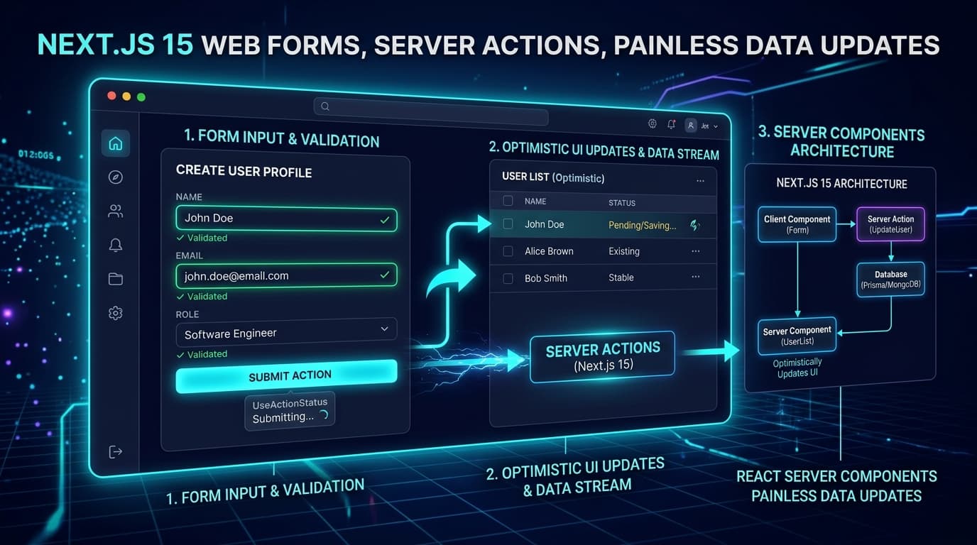
Building Simpler Web Forms: How Next.js 15 Makes Data Updates Quick and Painless
Master modern form handling with Next.js 15 and React 19. Learn how native Server Actions, useActionState, useOptimistic, and Zod schema validation eliminate boilerplate, achieve sub-50ms feedback, and ensure flawless data integrity.
AI Tool Creation & Software Modernization
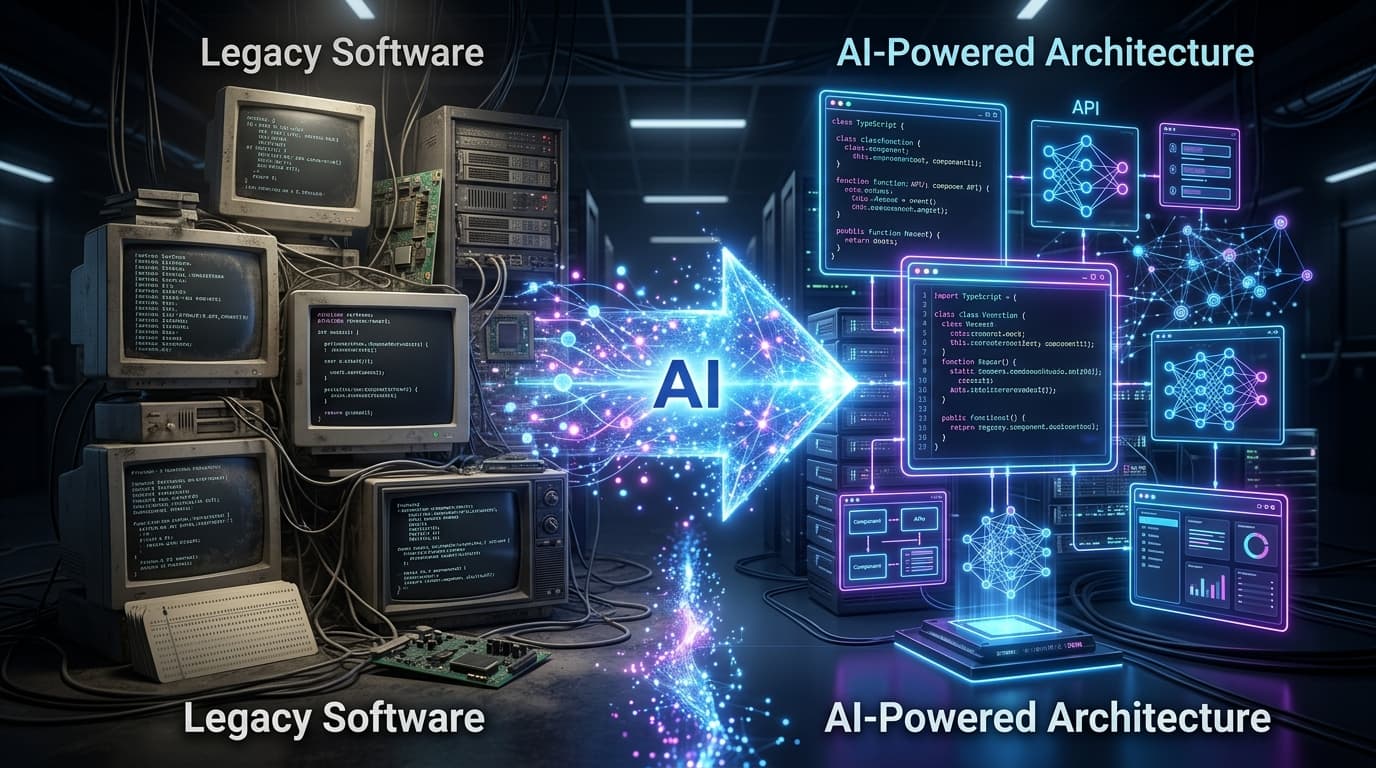
Upgrading Outdated Software with AI: How Modern Teams Automate Boring Code Updates Safely
Discover how modern engineering teams safely automate legacy software modernization using AI. Learn how Abstract Syntax Tree (AST) parsing, synthetic characterization testing, sandboxed refactoring agents, and human-in-the-loop verification reduce migration time by 80% with zero production downtime.
AI System Creation & Cost Optimization
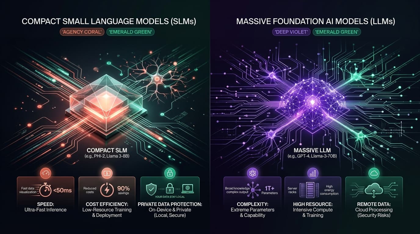
Small AI Models vs Big AI Models: How to Pick the Right Tool, Cut Costs, and Protect Privacy
Master the strategic decision framework between Small Language Models (SLMs) and Frontier Large Language Models (LLMs). Learn how modern engineering teams use intelligent model routing, on-premise local hosting, and targeted LoRA fine-tuning to slash inference costs by 80%, achieve sub-200ms response times, and guarantee 100% data privacy.